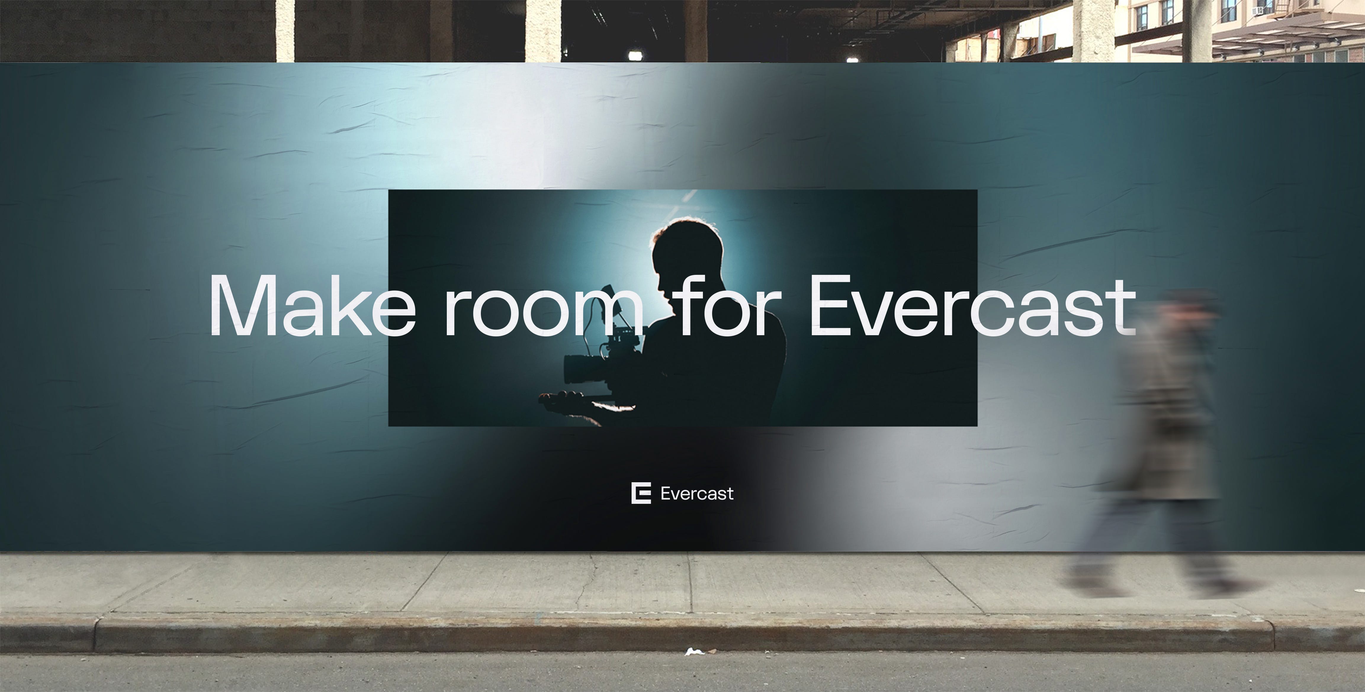
Making Room: How Evercast’s Rebrand Came to Be
A guest piece by Jessica Cyrell, Head of Communications at Evercast
This is the story of Evercast’s big makeover. Our Cinderella moment. Now, every good makeover tale shares the before and after — so, in order to understand how we got here, you should know a little bit about where we came from.

Before the glow-up was the grow-up
Every young company faces a point in time when they’re forced to sink or swim. For Evercast, that point hit us like a 200,000-ton cargo ship going 40 knots per hour.
It was March of 2020, and without warning, the Covid-19 pandemic took the world by storm. Like many others in the workforce, professionals working in media and entertainment were suddenly strapped to their homes with deadlines still looming. Evercast, being a remote collaboration platform for creative professionals, quickly shifted from something that was “nice to have” to something everyone needed — STAT. Every film editor, VFX artist, sound mixer, and more clamored for a solution. They needed a way to enjoy face time with their teams and livestream their work — anything that would give them a taste of the productive “old days” when they could work side-by-side in the same room.
Word got around that Evercast… was that thing.
Our inboxes overflowed, the phones rang off the hook (is the hook still a thing?), and truthfully, the software was quaking from the unprecedented weight of usage. As the Evercast team living that Titanic moment, all we really cared about was hanging on by a thread of our pants and not falling off. If we could make it through without the platform imploding, that would be a success. And, spoiler alert: we did it. We survived. More than that, we thrived.
Evercast’s revenue grew more than 1400% between February and December of 2020. During that insane period of time, we hired dozens of people, we expanded our servers, and we each worked the equivalent of about four jobs to make it happen.
In October, Evercast received an Engineering Emmy Award with special recognition for our part in helping the industry carry on during the Covid pandemic. But — we didn’t pop the champagne. Well, okay, we did do that. But then we got right back to work.
By now, we had proven we could rise to the occasion. But in order to take Evercast to the next level, it was time to show that we could clean up nice, too.
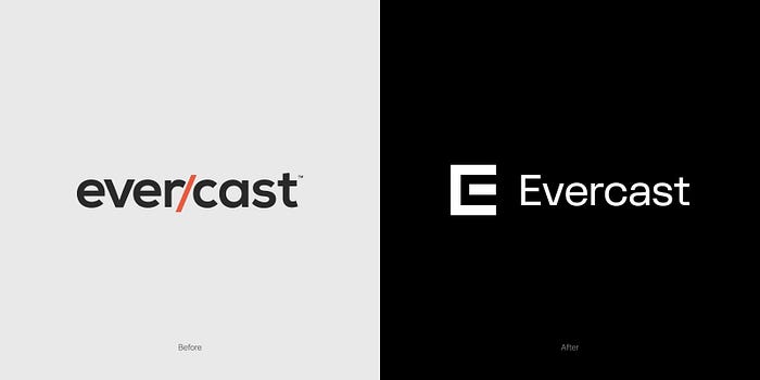
So there we were. Picture an episode of “Queer Eye”: Bleary-eyed software developer works 20-hour days; he hasn’t shaven in months, and his shirts fit a little too tight around the midsection. His new friends (in this case, the newly minted Evercast marketing team) tell him he’s better than that. And he solemnly agrees.
Enter the fab five of the branding world: Moving Brands
By this point, it’s September of 2020, and we’ve barely made it to the surface for a sip of air when we decide to bring in the premiere creative agency, Moving Brands — the design wizards behind some brands you’ve probably heard of: Apple, Google, Facebook, Netflix, Sony, just to name a few.
We knew from the first meeting that Moving Brands spoke our language. They pride themselves on being a company founded on creativity and innovation, which is precisely how we describe ourselves at Evercast. It’s why we ultimately entrusted Moving Brands to take on not just our logo or identity system, but the entire body of our brand, including our website, motion graphics, the software user interface, our swag, and interactive experiences across every touch point.
Creating a visual identity for a brand like Evercast is not straightforward. We are a company built for creatives by creatives, so we wanted our new brand to speak to our understanding of creativity — yet it simultaneously had to reflect sophistication, reliability, state-of-the-art technology, and impenetrable security. We wanted to dazzle, but we didn’t want to distract from the art that people make through our platform. At the end of the day, our job as a piece of technology is to get out of the way, not draw attention to ourselves. Moving Brands understood the many paradoxes and the layers of what we wanted to convey.
“Through demos and our own use of Evercast, we could feel that there was something special about it — there is a feeling of a place where something truly amazing can be created,” said Devin Carter, design director at Moving Brands. “The foundation of the identity was built around the idea of ‘pro-grade collaboration’: a foundation that acted as a stage for a variety of content to live and ideas to be made real.”
Knowing that the kind of content produced through Evercast runs the gamut creatively, Moving Brands also aimed to reflect the multidimensionality of the product and where we were going with it.
“A major consideration for us was ensuring that we created something that was beyond video collaboration and beyond Hollywood, something that could pave the way for collaboration across multiple industries and sectors all striving to make amazing creative, whether that be in film, advertising, gaming or beyond,” said Carter.
The branding journey begins
The first step was to invent a symbol that captured the essence of Evercast.

“The original sketch of the symbol we ended up with was an intuitive rendering trying to capture strength and boldness, while being able to see ‘E’ and a ‘C’ at the same time,” said Jim Bull, founder and CCO of Moving Brands. “We were trying to capture a symbol that had DNA that links to both the core product and audience — the center bar of the ‘E’ and the negative space around it create an abstracted screen.”
For the Evercast team, it was love at first sight.
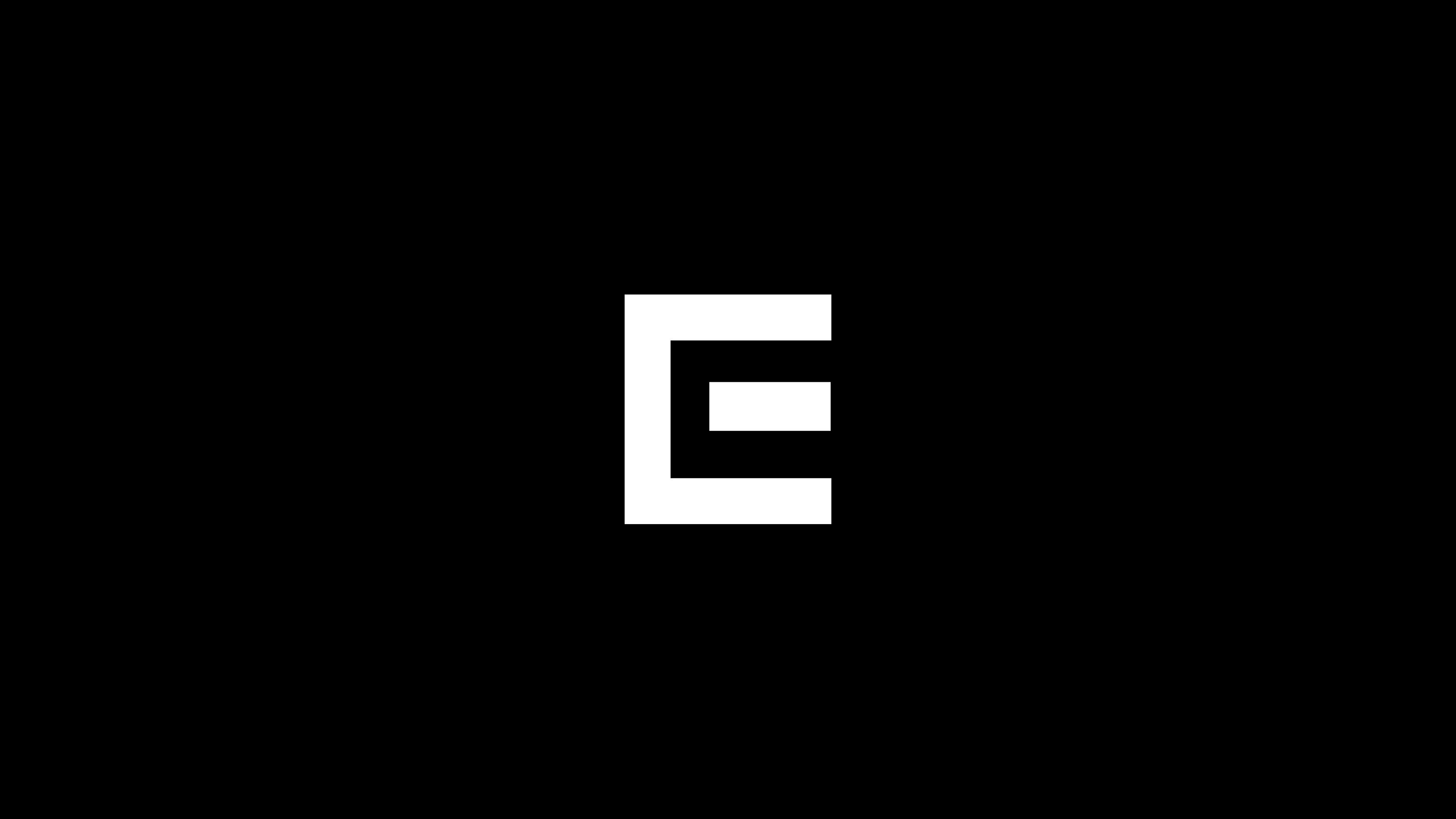
The symbol was bold, iconic, cutting-edge, timeless. There was an underlying sense of forward movement, even a hint of a magnetic quality. It was powerful.

The Moving Brands team directed our eyes again to that center bar: the abstract screen or portal, which would soon become a driving force within the visual identity we were building. And it wasn’t long before it took on a life of its own.
“Motion is and always has been imperative to our creative process at Moving Brands, so when it came to creating an identity for a brand that is built for the big and small screen, it was a brilliant opportunity to put motion at the heart of the identity,” said Carter. “We set out to create something that feels of the cinematic world — something that explores light, depth, shadow. And something that can inherently adapt and act as a stage for a variety of content.”
The room
At Evercast, we have a name for the virtual space where you create and collaborate with your team: we call it the “room.” In literal terms, an Evercast virtual room is simply a web link that you access in order to video conference and view content in real time with your team. On a deeper level, a room is far more than that. We always knew it, but the pandemic elevated the perception for everyone else. With the introduction of Covid regulations, virtual sessions were no longer the alternative to in-person collab sessions; instead, they became the only collab sessions. The room was where the magic happened, and it needed to feel special.
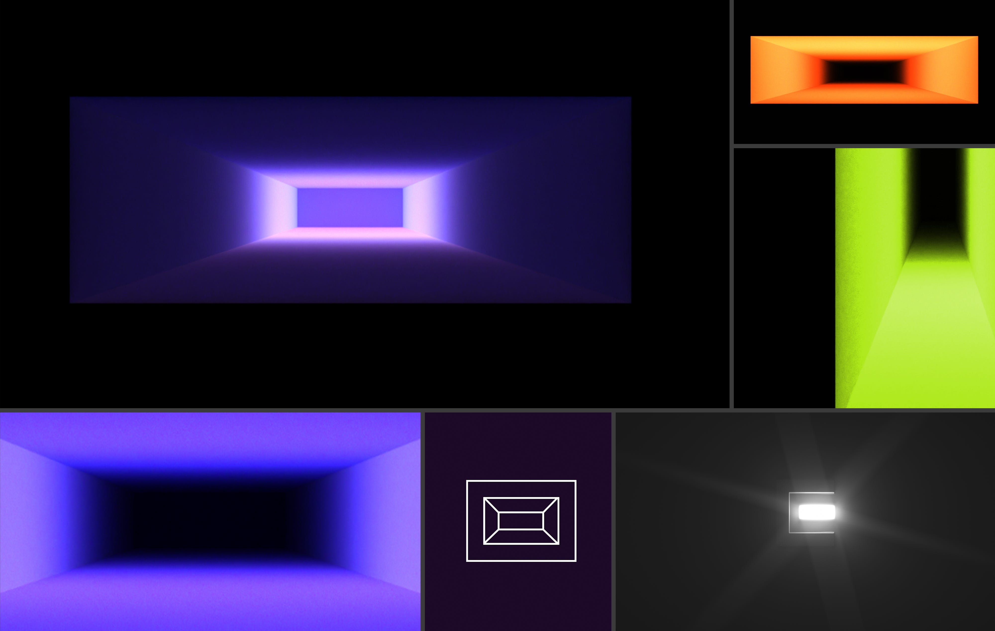
“We felt that the idea around entering a space that was entirely your own to create something magical was a powerful way into the identity — this idea that you’re transported through something to a place that provided you with the opportunity to create something amazing,” said Carter. “That led to motion that focused around the idea of a room containing amazing content, and in the product the sense of moving through a rectangle into the room. So the room is really at the heart of the identity.”
Channeling the energy of the virtual room led to two striking features. The first was a crowd favorite among the Evercast team, which we call the “skyscraper.” It’s a stunning motion graphic that magnifies the beauty of any content living inside it. The “skyscraper” ultimately became the crown jewel of the homepage of our website.

The second feature inspired by the virtual room is one we have lovingly come to call the “wormhole”: a hypnotizing red portal-like animation triggered as you enter your virtual room, seemingly transporting you to another dimension where creativity lives.

Nailing the balance
We were beginning to sculpt the Evercast experience. It was dynamic and entrancing in all the right ways — but we had to remember there was a time and place for standing out and equally for sitting back. Evercast exists to enable creative work, not compete for users’ attention. Our new color palette exemplifies this balance, especially in the case of the software interface, where users are actively creating and viewing content.
“The color palette is intentionally dark because we want the content to be king,” said Carter. “The idea behind the room is that it’s always there — it casts subtle light (the black, charcoal, and petrol color) and when content is cast into the box, the environment responds with light, shadow and color. This gives us an ever-evolving palette of soft and harsh ambient light to create a powerful look and feel.”

On the flip side, our web presence allowed us plenty of space to play.
“We set out to create something that was differentiated and eye-grabbing especially across social, where posts and communications live and die in an instant,” said Bull. “Color, motion and messaging all play a part in this.”
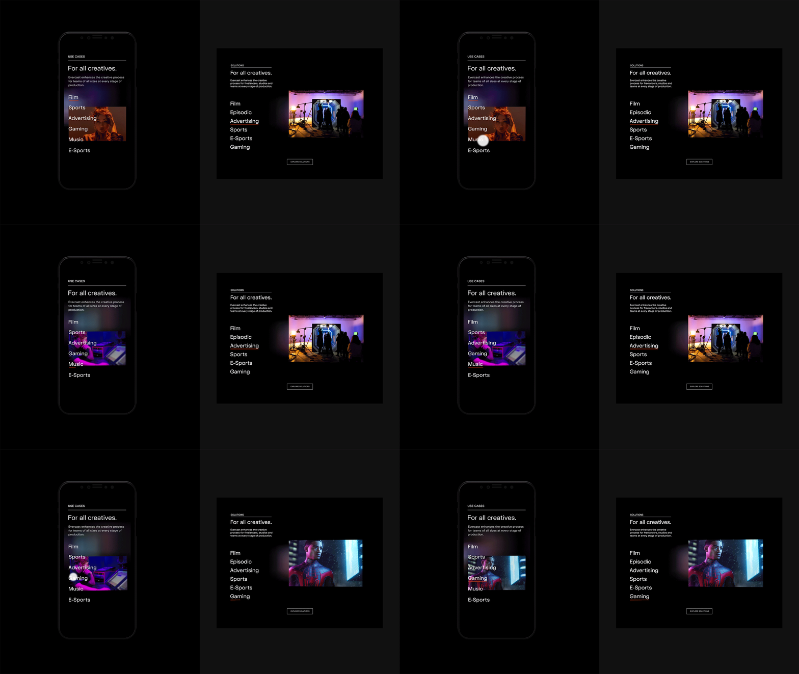
The beauty of what Moving Brands created is in the flexibility — the ambient textures, patterns, colors, and typography — which allow the brand to shine when it’s given permission and to tone it down when it’s not, all the while feeling true to its identity.
Evercast’s big day
Evercast’s grand-brand-debut coincided with a major new product release: the most powerful version of Evercast to date. In the background, over the course of many months, our development team had been steadily rebuilding the technology from the ground up, adding new features and elevating the Evercast experience in nearly every way. By 2021, the new branding was one element of the gargantuan feat we had accomplished. But it was far more than a little piece of the puzzle. It allowed our outer appearance to reflect the beauty of what we had built on the inside. It gave our new product wings.
Like every rags-to-riches story, the tale culminates in the belle arriving at the ball. When February came around, we launched the new Evercast to great success. But… in our rewrite, Cinderella doesn’t turn into a pumpkin at midnight. Midnight strikes, and the party’s just getting started.
Evercast’s big makeover? This is only the beginning.
